
Layering & Composition
28 February 2017 19:16
Since I've been scanning my prints I've started layering them too. Look at the results!

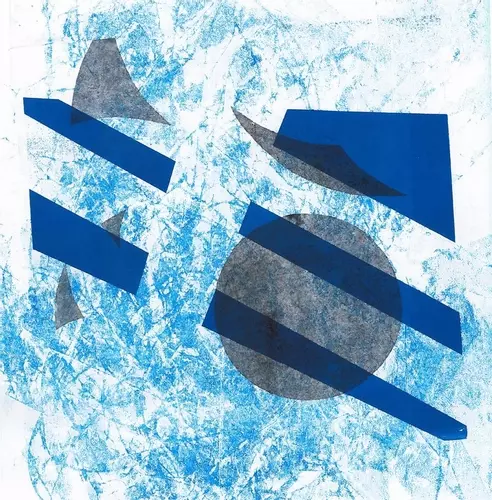
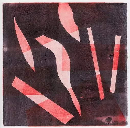

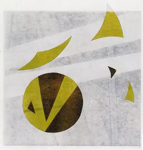
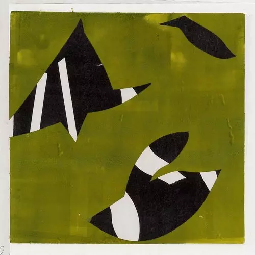
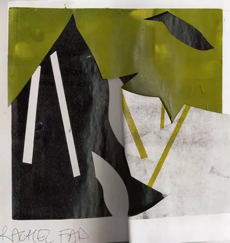
I think what there is that looks good compositionally is a compensation for a lack of depth and contrast through layering with a deeper or lighter colour.
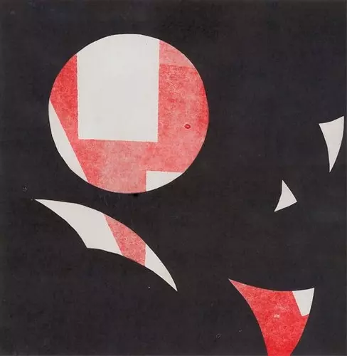
I think it's quite hard to define what works in terms of composition, especially with just basic locks of colour. Here's an example of one of Mark Rothko's colour-field paintings: